
Reviewed by: Andrey Shelokovskiy, General Manager & Alan Ely, Production Manager
Last updated: July 3, 2026
Walk into two coffee shops on the same block. One feels warm, calm, like a place you’d linger; the other feels generic, and you can’t quite say why. Often the difference isn’t the furniture or the lighting — it’s the color on the walls, doing its work quietly in the background. Color is the cheapest, fastest lever a commercial space has to shape how people feel in it, and it’s the one most businesses treat as an afterthought.
Choosing commercial paint colors well isn’t about chasing the year’s trend. It’s about matching color to purpose: what the space is for, how you want people to feel, and what your brand is trying to say. Here’s how to think about it for offices, retail, and restaurants — and the mistakes worth avoiding.
Color by Goal
|
Start With the Job, Not the Swatch
The most useful question isn’t "what color do we like?" — it’s "what does this room need to do?" An accounting floor needs calm and concentration. A boutique needs to feel current and a little elevated. A casual taqueria needs energy and warmth. The best colors for commercial spaces are the ones that serve that job. Get the purpose right and the palette mostly chooses itself.
Color isn’t decoration in a commercial space. It’s part of the experience you’re selling.
Office Paint Colors: Calm That Reads as Competent
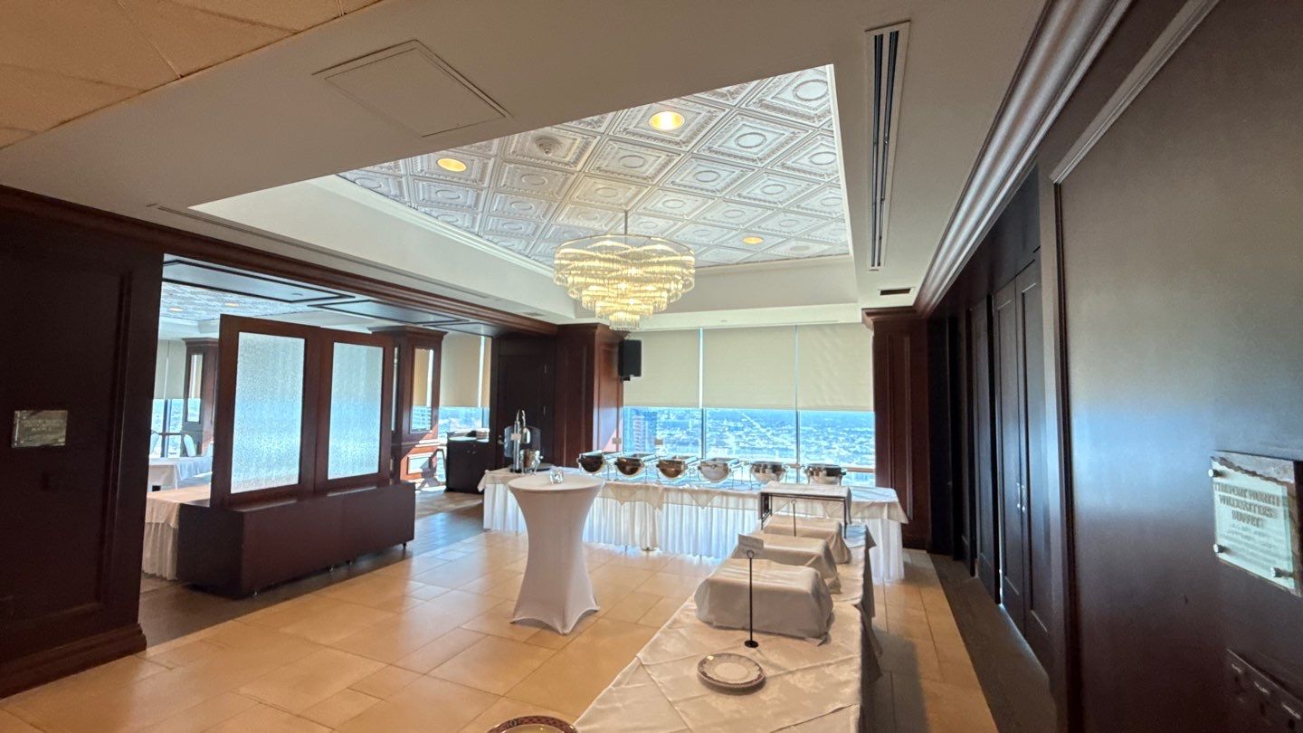
Professional office colors lean toward neutrals — soft whites, warm greys, greige, muted blues and greens. There’s real psychology behind it: blues and greens are associated with focus and steadiness, and a clean neutral backdrop keeps attention on the work while reading as polished to a visiting client. This is why so many well-run offices look, at first glance, almost understated.
The mistake: all neutral, no point of view
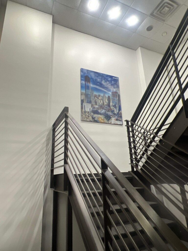
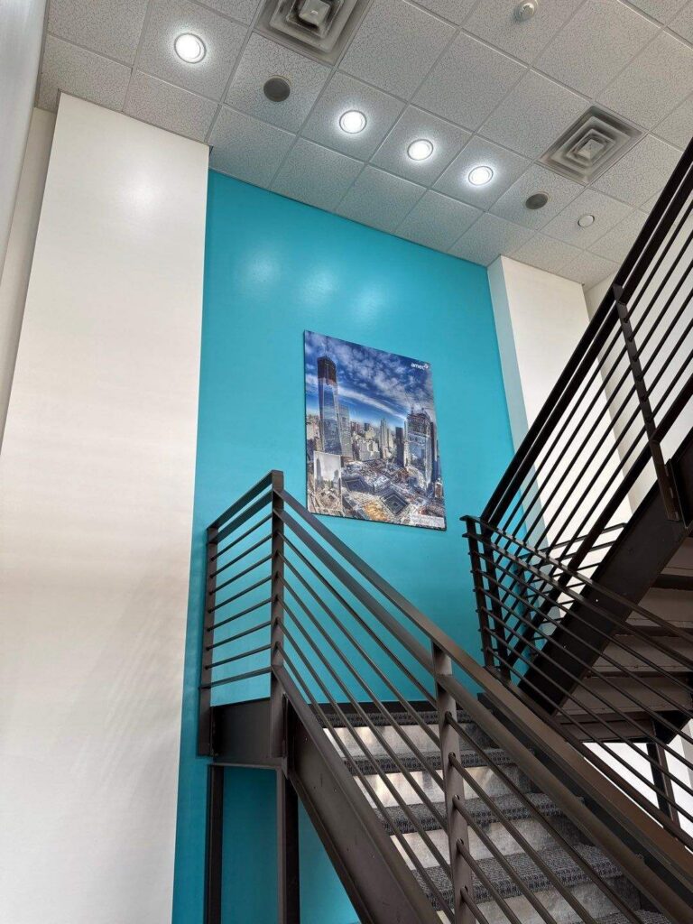
Wall-to-wall greige is safe and a little soulless. The fix is to place color deliberately — a brand-colored accent wall in reception, a richer tone in the conference room, warmth in the collaboration zones. You get personality and brand reinforcement without turning the floor into a distraction. The neutrals do the daily work; the accents tell people whose office this is.
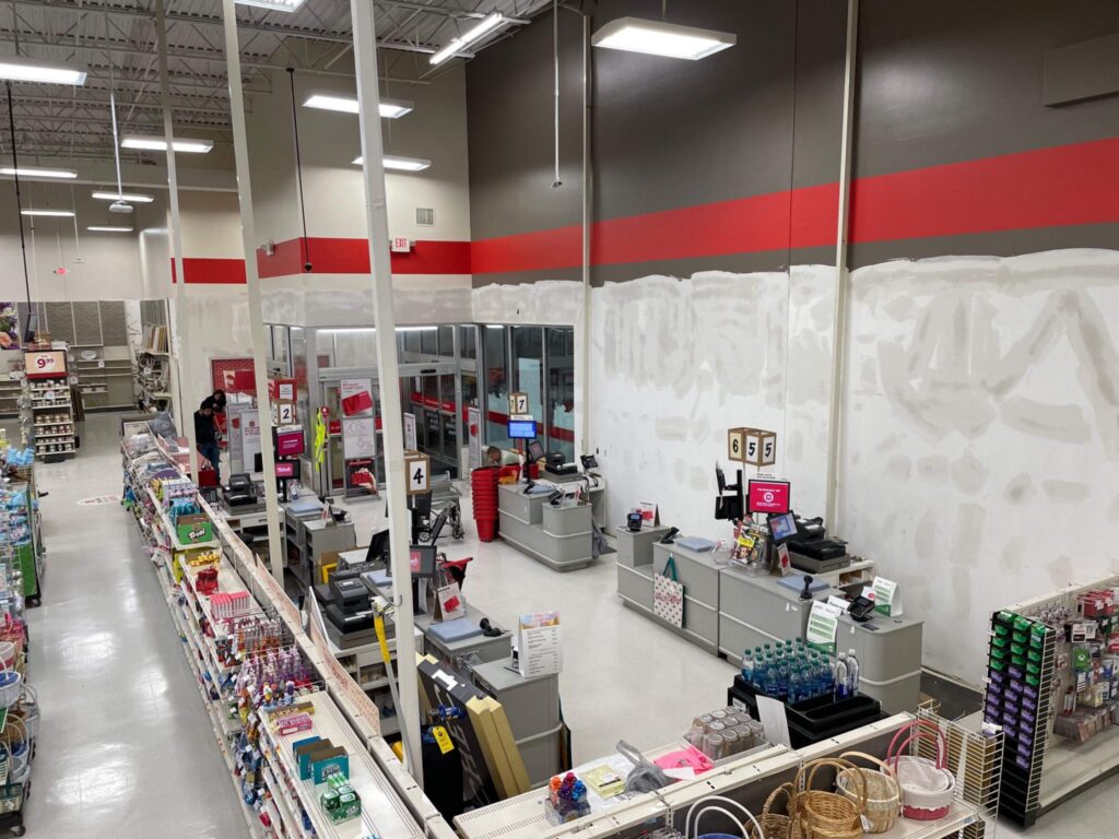
Retail Store Paint Colors: Frame the Product, Don’t Compete With It
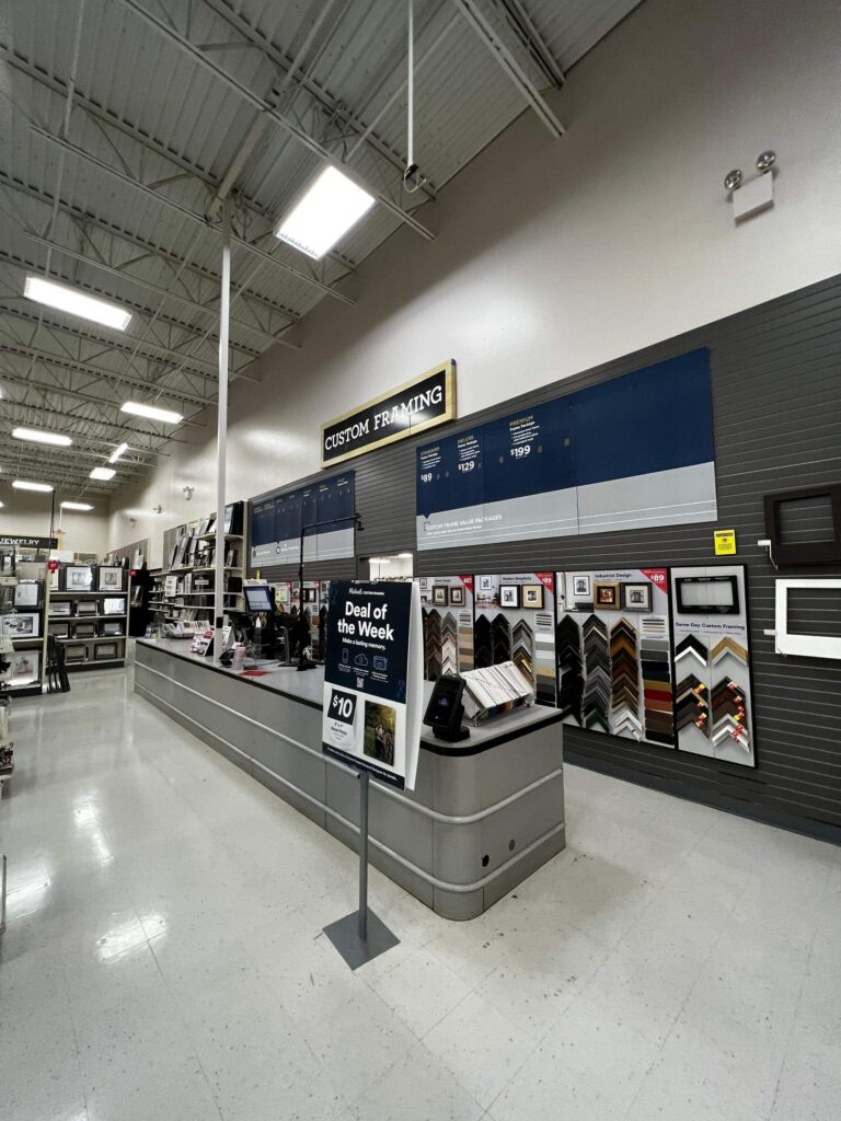
In retail, the merchandise is the star and the walls are the stage. That’s why so many of the strongest retail palettes are restrained — crisp whites, soft greys, warm off-whites — that let products, displays, and lighting carry the color. Then a brand-driven accent wall or feature zone directs the eye and creates the moment customers photograph.
Match color to who you’re selling to
Positioning should drive the palette. A luxury boutique can go deep and sophisticated to feel premium and exclusive; a kids’ store can go bright and playful to feel fun. The color isn’t just decoration — it’s a signal that tells a shopper, within seconds, whether this is their kind of place.

Restaurant Paint Colors: Engineering the Mood
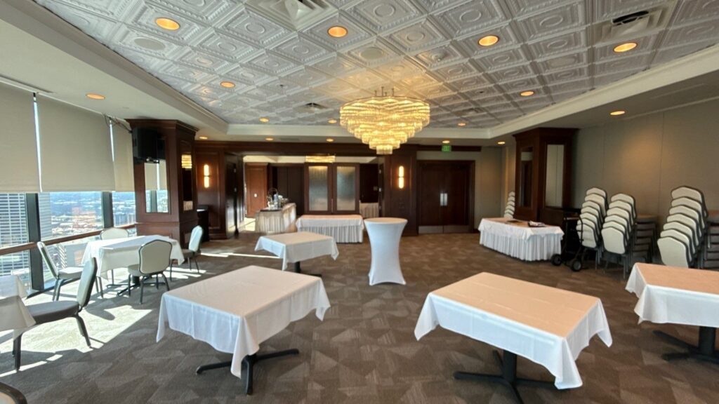
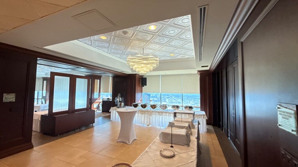
Restaurants use color more deliberately than almost any other space, because it shapes appetite and atmosphere. Warm tones — terracotta, warm reds and oranges, earthy clays — feel inviting and energetic, which is why they show up so often in casual and family dining. Cooler, deeper, moodier palettes suit upscale and intimate concepts, where the goal is calm, sophistication, and a slower pace.
Make the color part of one story
The palette has to agree with the concept. A cozy café, a sleek modern bistro, and a vibrant cantina each want a different color logic, and color, lighting, and décor should tell one coherent story a guest feels the moment they walk in. When the walls fight the concept, the room feels "off" even if no one can name why.
Five Things That Separate Good Color Choices From Regrets
- Test in the actual space — paint shifts dramatically under different lighting, and a swatch under store fluorescents is not the same color you saw in the shop.
- Tie accents to your real brand palette, not an approximation, so signage, walls, and materials agree.
- Remember durability — in high-traffic zones, the finish matters as much as the color, and some deep colors show wear faster.
Best Paint Finishes for Commercial Walls
- Use restraint — a few intentional colors almost always beat a busy, over-themed palette.
- Think about longevity — a bold trend color dates fast and gets expensive to undo; timeless neutrals with accent colors age more gracefully.
Bring the Brand to the Walls
A real color strategy turns a generic box into a space that feels unmistakably yours. The practical work — translating brand colors into wall-ready paint, testing them under your actual lighting, and applying them with the right durability — is where a commercial painter earns their place. Nomad Coatings helps DFW offices, retailers, and restaurants choose and apply commercial paint colors that support the brand and hold up to daily use.
Frequently Asked Questions
Neutrals like soft white, warm grey, and muted blue or green create a calm, professional backdrop. Add brand colors as accents in reception areas and conference rooms for identity.
Get Your Free Commercial Estimate
Want a color strategy, not just a color?Nomad Coatings helps DFW businesses translate their brand into a real-world palette, test it in their space, and apply it to last. Request a free commercial estimate today. |
Call us at (817) 382‑6004 or drop us a note through the Contact form. We’ll set up a walkthrough or review your plans, and get you a clear proposal. Let’s get it done right the first time.